

+1 (332) 900-1500
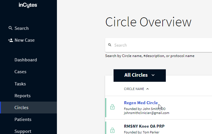
2. In the Circle Analytics field, select Compliance and Adherence → PATIENTS

3. The graph divided into one-week periods will display. There are two columns for each period:
Blue column - My Cases - all patients enrolled into the cases created by you for this Circle
Black column - All Circle Cases - all patients enrolled into the cases created by all the Circle Members (including yourself) for this Circle
The statistics in the graph only include patients who have provided an email and/or mobile phone in their contact information and meet the following criteria:
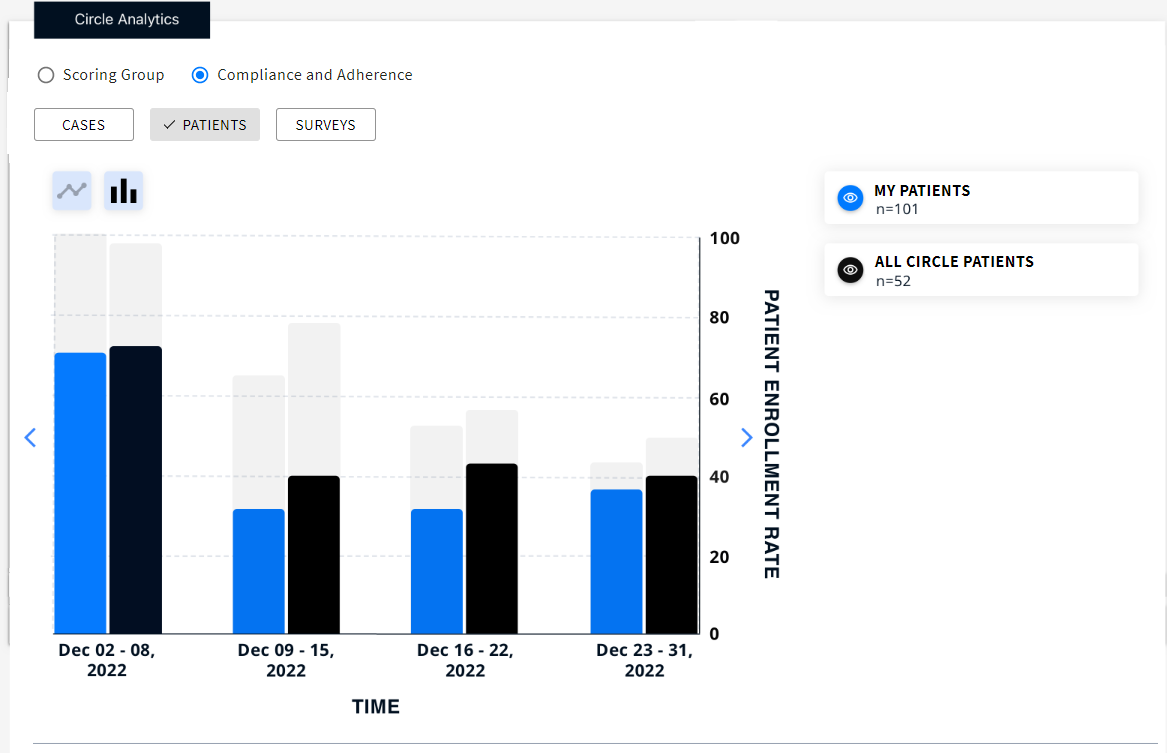
Tip: You can switch off/on the required column on the graph by clicking the corresponding eye icon on the right of the graph.
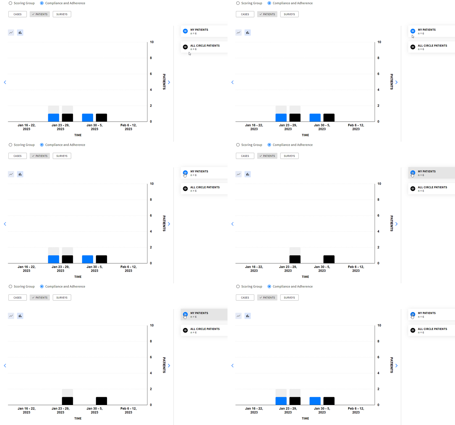
4. Hover your mouse over the required column to see the actual and the expected number of enrolled patients.
Actual - all patients joined the platform for the given period including self-enrolled patients + the rate to the expected number.
Expected - all the patients who are expected to join the platform for the given period as they have commencement date in this period.

For example, looking at the image, we can see that 2 patients have registered, and the expected number of patients to register is 2, resulting in a completion rate of 100%.
Special Cases
Search keywords:
Tomorrow's Healthcare Decisions. Todays's Real World Evidence.
